전산정물(電算靜物)Digital Still Life
전산정물(電算靜物)
Digital Still Life
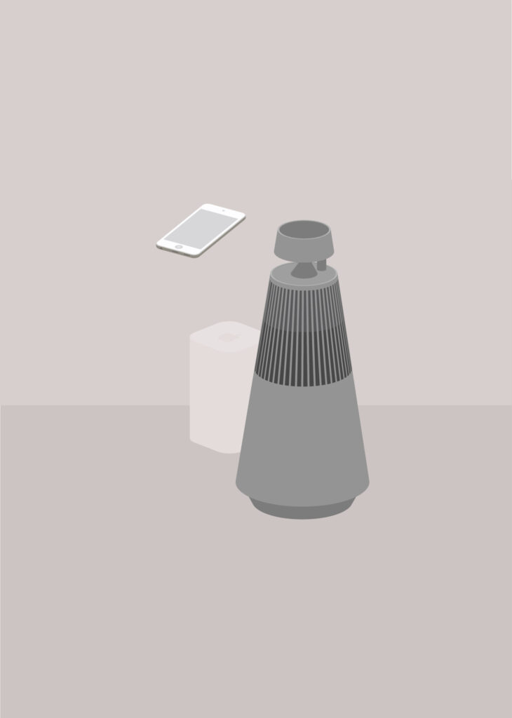
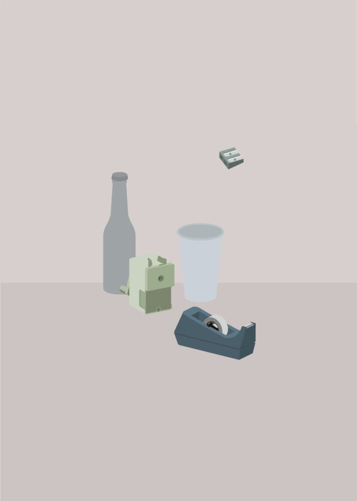
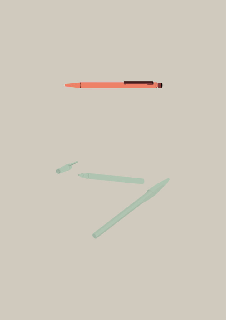
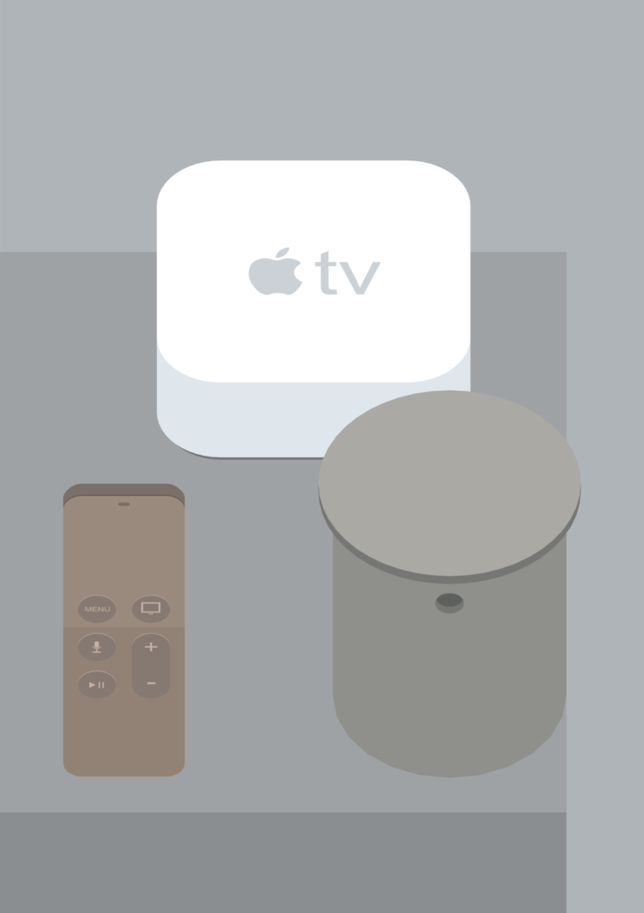
컴퓨터라는 디지털 도구는 나에게 아날로그 회화를 보완하는 매개체다. 선을 정확하게 다루는 디자이너의 습관은 자연스럽게 회화에도 투영된다. 붓의 흔적과 흐릿한 경계에서 회화적 매력을 찾는 방식과 달리, 나는 정확한 선과 형태를 바탕으로 한 회화를 추구한다.
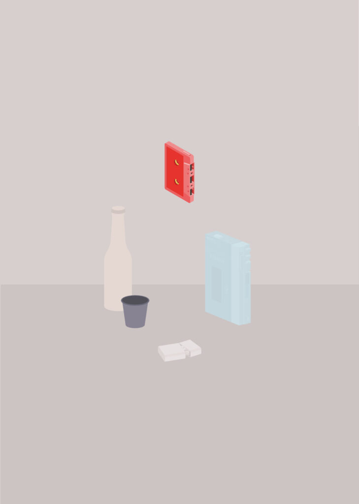
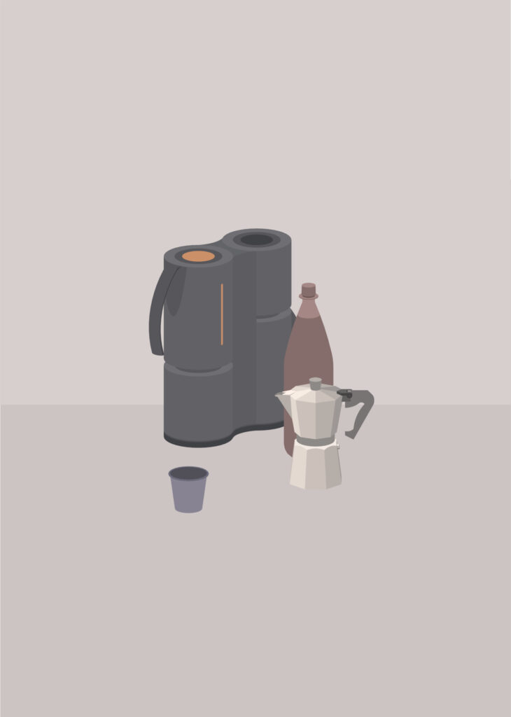
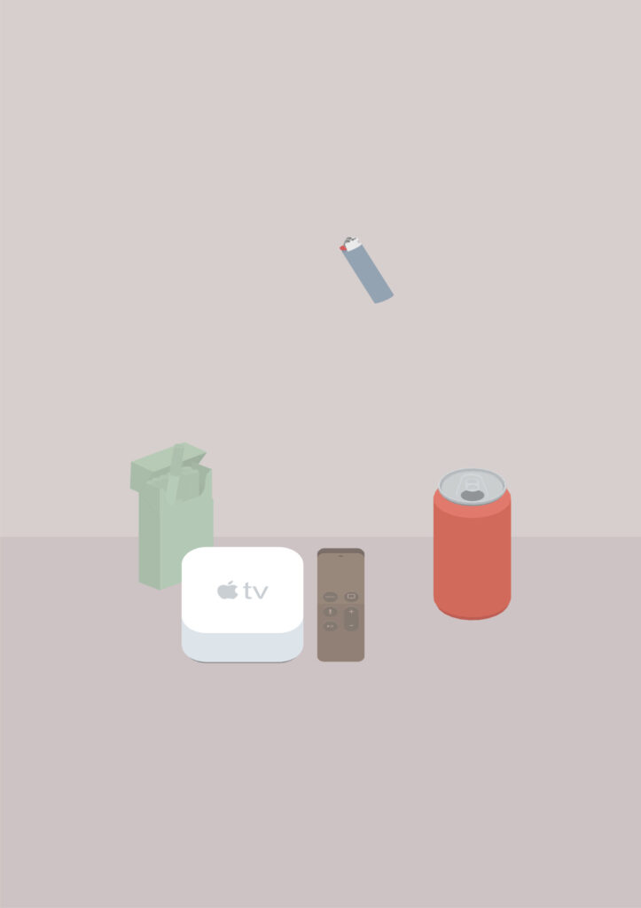
산업디자인을 전공한 경험을 바탕으로 아름다움과 상징성을 지닌 산업제품을 회화의 대상으로 삼는다. 제품을 3D로 모델링하고 다양한 시점과 각도를 탐색해 가장 아름다운 조형적 순간을 찾아낸다. 이를 2차원의 정물로 구성한 뒤 캔버스에 옮겨 색채를 입힌다. 디지털의 정확성을 아날로그 회화의 언어로 전환하는 과정이다.
이러한 작업의 조형적 배경에는 동서양의 정물화 전통이 자리한다. 한국 전통회화의 문방사우(文房四友)와 책가도(冊架圖)는 사물의 배치와 관계, 공간의 구성만으로 독자적인 미감을 형성해 왔다. 특히 책과 문방구, 도자기 등 일상적 기물에 담긴 상징성과 조형적 질서는 오늘날 산업제품을 회화의 대상으로 바라보는 나의 시선과도 맞닿아 있다.
서양 회화에서는 조르조 모란디(Giorgio Morandi, 1890–1964)의 절제된 색감과 정물 구성, 데이비드 호크니(David Hockney, 1937–2026) 초기 회화의 조형적 구도와 공간 구성에 주목해 왔다. 마이클 크레이그 마틴(Michael Craig-Martin, 1941– )의 사물에 대한 시각적 해석에서도 접점을 발견한다. 그러나 나의 작업은 이러한 조형적 접근을 바탕으로 보다 회화적인 색채와 표면의 감각을 추구한다.
디자인과 회화의 경계를 넘나드는 시도는 국내외에서 다양하게 이루어져 왔다. 나탈리 뒤 파스키에(Nathalie Du Pasquier, 1957– )의 작업 역시 사물의 비정형적 배열과 색채, 기하학적 구성을 통해 독자적인 조형미를 제안한다. 나의 작업은 즉흥적인 감성이나 우연한 붓 터치보다는 의도적이고 체계적인 디자인 언어를 바탕으로 한다. 대량생산 제품에 내재된 아름다움을 정물화의 형식으로 재해석하고, 이를 회화의 영역으로 확장하고자 한다.
내가 주목하는 또 하나의 대상은 서울의 색이다. 맑고 선명한 날보다 흐리고 뿌연 날이 익숙한 도시. 인공물로 가득한 서울에는 특유의 회색빛 정서가 있다. 뿌연 대기의 색, 황토빛 황사, 도시를 감싸는 먼지의 색. 이러한 미묘하고 다채로운 색채를 화면에 담고자 한다.
산업제품에서 아름다움을 발견하고, 디지털의 정확성을 거쳐 회화로 표현하는 일. 이는 사물의 재현을 넘어 우리가 살아가는 도시와 시대의 감수성을 그리는 작업이다. 대량생산된 사물의 보편적 아름다움을 통해 새로운 디자인 회화의 가능성을 탐색한다.
The computer, as a digital tool, serves as a medium that complements my analogue approach to painting. My professional habit as a designer, particularly my attention to precise lines, naturally finds its way into my paintings. While much of painting explores the expressive qualities of brushstrokes and blurred boundaries, I pursue a different approach—one grounded in the precision of line and form.
With a background in industrial design, I take industrial products of aesthetic and symbolic significance as subjects for my paintings. I first construct each object through 3D modeling, exploring different viewpoints and angles to discover its most compelling form. This selected view is then composed as a still life on a two-dimensional plane, transferred onto canvas, and brought to life through colour. It is a process of translating digital precision into the language of analogue painting.
The formal foundations of this practice draw upon both Eastern and Western traditions of still-life representation. In Korean traditional painting, Munbangsawoo (文房四友), the Four Treasures of the Scholar’s Studio, and Chaekgado (冊架圖), paintings of bookshelves and collected objects, establish distinctive aesthetic compositions through the arrangement and relationships of everyday objects. The symbolic meanings and formal order of books, writing implements, ceramics, and other objects resonate with my own approach to industrial products as subjects for painting.
In Western painting, I have been particularly drawn to the restrained palette and still-life compositions of Giorgio Morandi (1890–1964), as well as the formal structures and spatial arrangements found in David Hockney’s (1937–2026) early paintings. I also find points of connection with Michael Craig-Martin’s (1941– ) visual interpretations of everyday objects. While these approaches inform my work, I seek to develop a more painterly sensibility through colour and surface.
Attempts to dissolve the boundaries between design and painting have taken many forms, both in Korea and internationally. The work of Nathalie Du Pasquier (1957– ), for example, proposes a distinctive aesthetic through irregular arrangements of objects, colour, and geometric composition. My approach, however, is founded less on spontaneous expression or incidental brushwork than on an intentional and systematic design language. By reinterpreting the inherent beauty of mass-produced objects through the genre of still life, I seek to extend the aesthetics of design into the realm of painting.
Another subject of my attention is the colour of Seoul. It is a city more familiar with overcast and hazy days than with clear, bright skies. Among its countless artificial objects and structures, Seoul possesses a distinctive atmosphere of grey. The muted tones of the air, the earthy hues of yellow dust, and the colours of dust that settle over the city—all these subtle and varied shades find their way onto my canvas.
To discover beauty in industrial products and translate it into painting through digital precision is, ultimately, to portray more than the appearance of objects. It is an exploration of the sensibility of the city and the era in which we live. Through the universal beauty of mass-produced objects, I seek to explore new possibilities for design-based painting.


- 대표
- 김성곤
- 디자이너
- 김성곤
- 이동전화
- 010 3763 6666
- 이메일
- kimseonggohn@naver.com
- 홈페이지
- http://kimseonggohn.com
- 인스타그램
- https://www.instagram.com/pie_in__the___sky
- CEO
- KIM Seonggohn
- Designer
- KIM Seonggohn
- mobile phone
- +82 (0)10 3763 6666
- e mail
- kimseonggohn@naver.com
- homepage
- http://kimseonggohn.com
- https://www.instagram.com/pie_in__the___sky
 http://www.kimseonggohn.com
 https://www.instagram.com/pie_in__the___sky
